Friend Graphs
For a long time I’ve had the colorful Facebook Friend Wheel on my Facebook profile, but I was always a little unimpressed with its grouping mechanism: Although it was generally pretty good, it always put a few friends in totally the wrong place, it seemed. Recently, I became interested in finding a better way to vizualize the mutual-friend relationships among my many facebook compatriots.
The two best applications that I’ve found so far are Touchgraph Photos and Nexus.
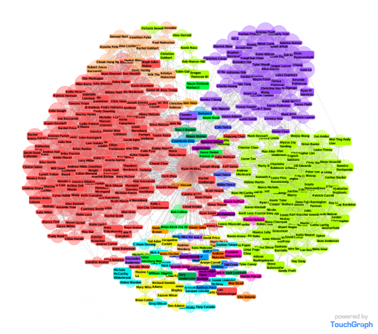
I like Touchgraph Photos because it renders the graph in real time (it is in Java, so the performance is fine up to about 100 friends, but when I go to all of my 400 connections, it slows to a crawl). Touchgraph Photos also lets you customize which networks and friends are shown, and, as the name implies, can show photos of each friend as well. Since I’m much more interested in the connections, I disable the photos and end up with a graph like this:
Each node can be dragged around, but with this many nodes it is slow and not very effective at moving groups around. I also noticed that some mutual friend connections are missing, which is the most perplexing part of this application. Nevertheless, it is pretty cool: IS kids are on the left in red, CSE kids are on the right in yellow-green, and BioE kids are in the upper right in purple.
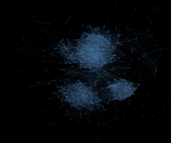
Next, I tried out Nexus, which takes a similar approach but without real-time rendering, and names are only shown when highlighting a node (all connected names also show up as well). The rendering engine looks cooler, too, but the result doesn’t have as much information in it:
You can see the same three groups in this rendering: IS kids are the top cluster, BioE kids are the bottom-right, and CSE kids are the bottom-left.
Good times!


June 3rd, 2009 at 09:06:34 pm
Already reducing your friends to statistics and graphs. *Sniff* You’re all grown up!